DE L’ORA
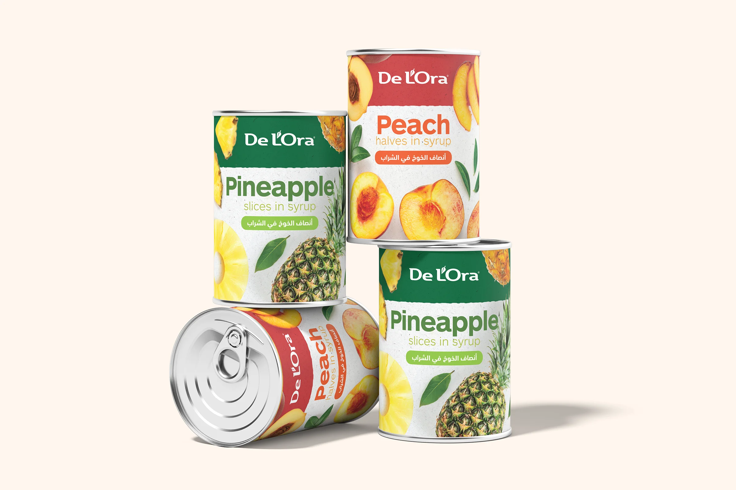
Reimagining a European heritage food brand for the MENA market through a clearer, fresher, and more contemporary packaging system.
THE CHALLENGE
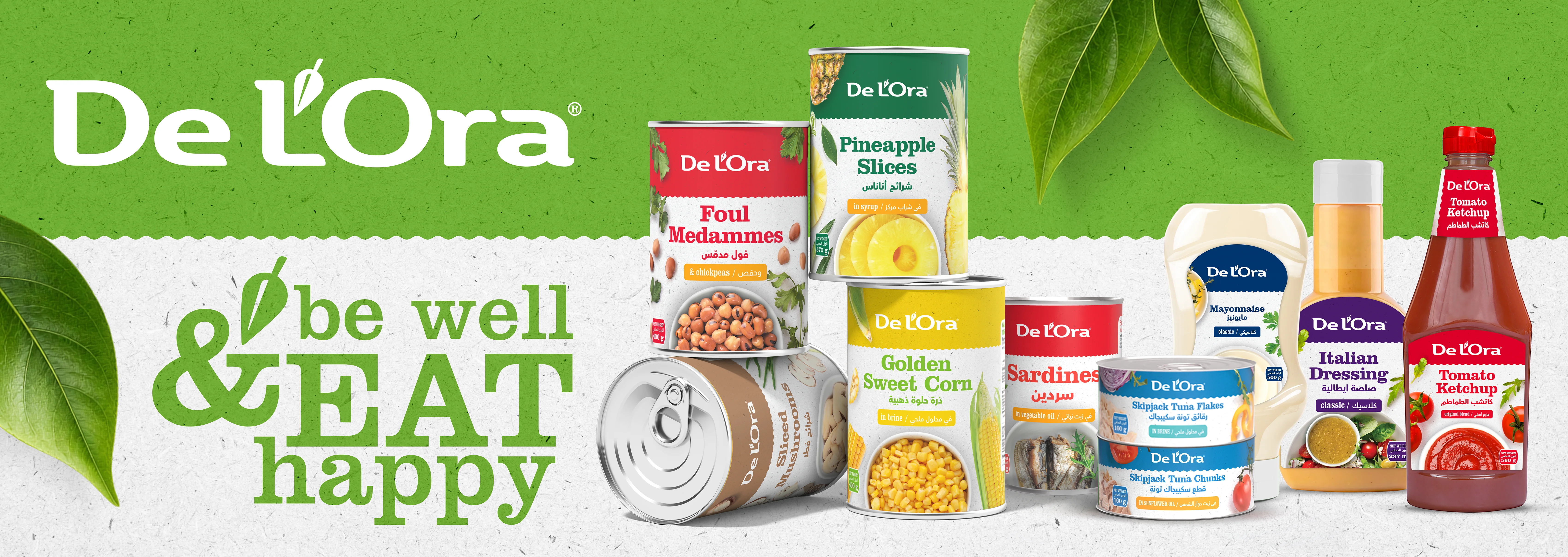
De L’Ora entered the project with a recognizable European heritage, but its existing packaging needed to work harder in the MENA market. The challenge was to create a more contemporary packaging language that could improve shelf visibility, communicate freshness and quality, accommodate Arabic and English naturally, and feel relevant to regional consumers without losing the brand’s established character.
DESIGNING FOR A DIFFERENT SHELF
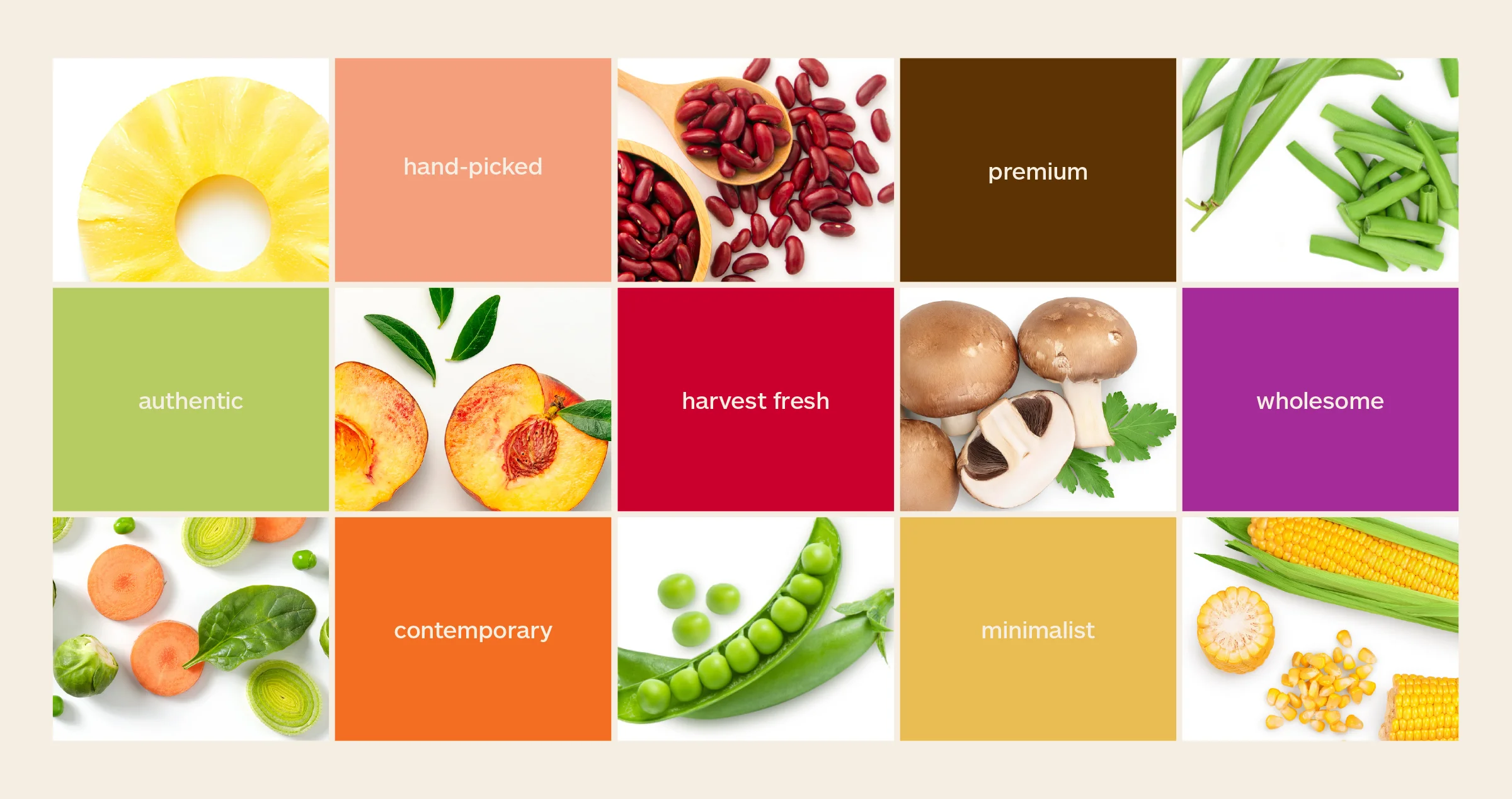
The MENA category places a premium on immediate recognition. Freshness, trust, appetite appeal and bilingual clarity all need to communicate within seconds, often in highly competitive retail environments. The opportunity was to simplify De L’Ora’s visual language while making the product itself more prominent.
THREE WAYS FORWARD
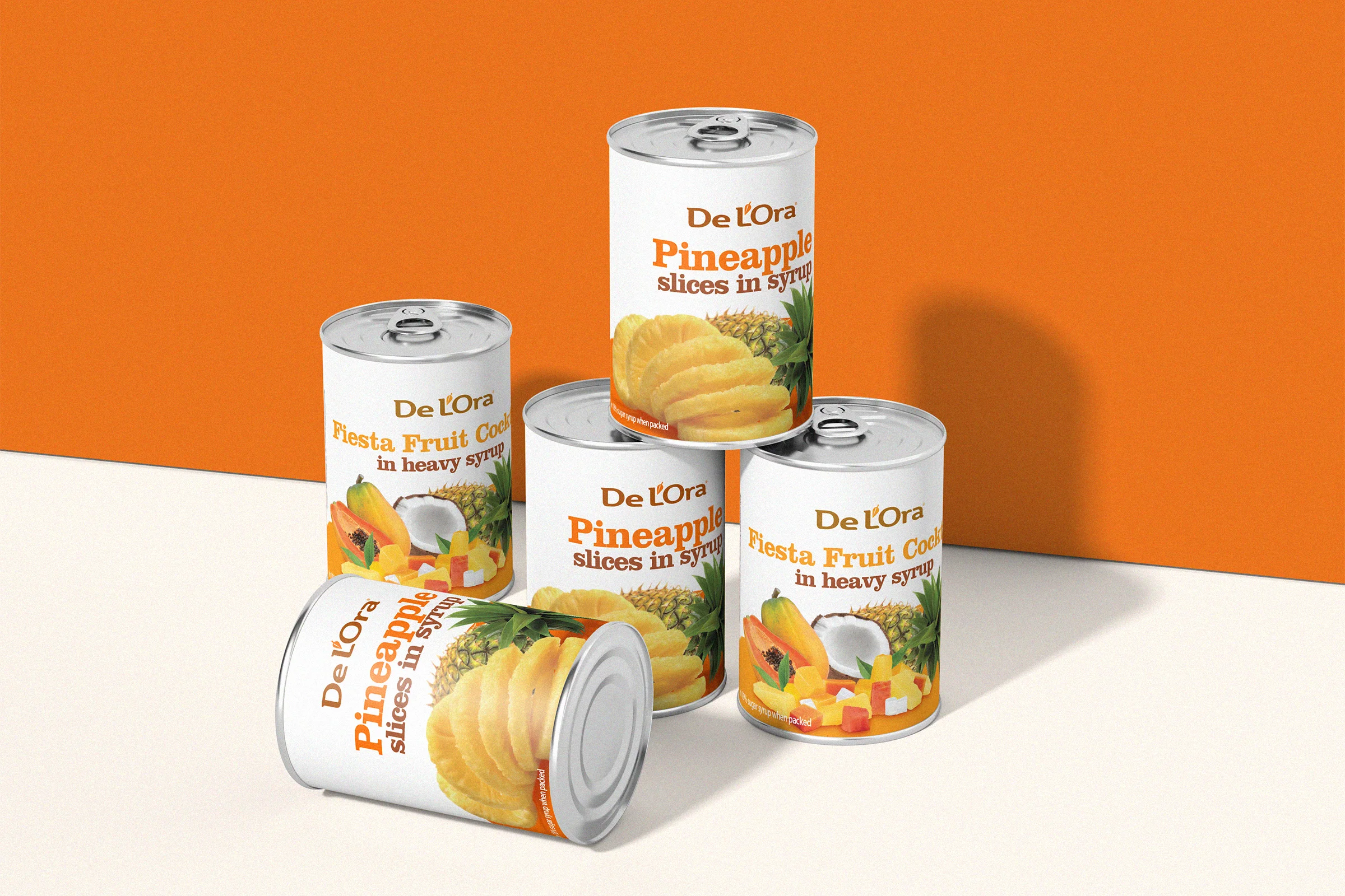
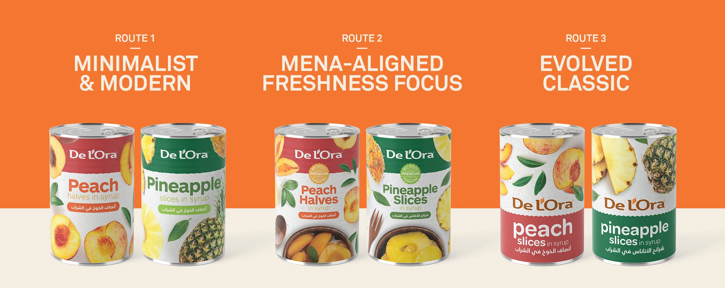
Rather than committing immediately to a single aesthetic, three directions explored different degrees of change, from an evolution of the existing packaging to a more distinctive contemporary expression.
ONE SYSTEM. A GROWING RANGE.
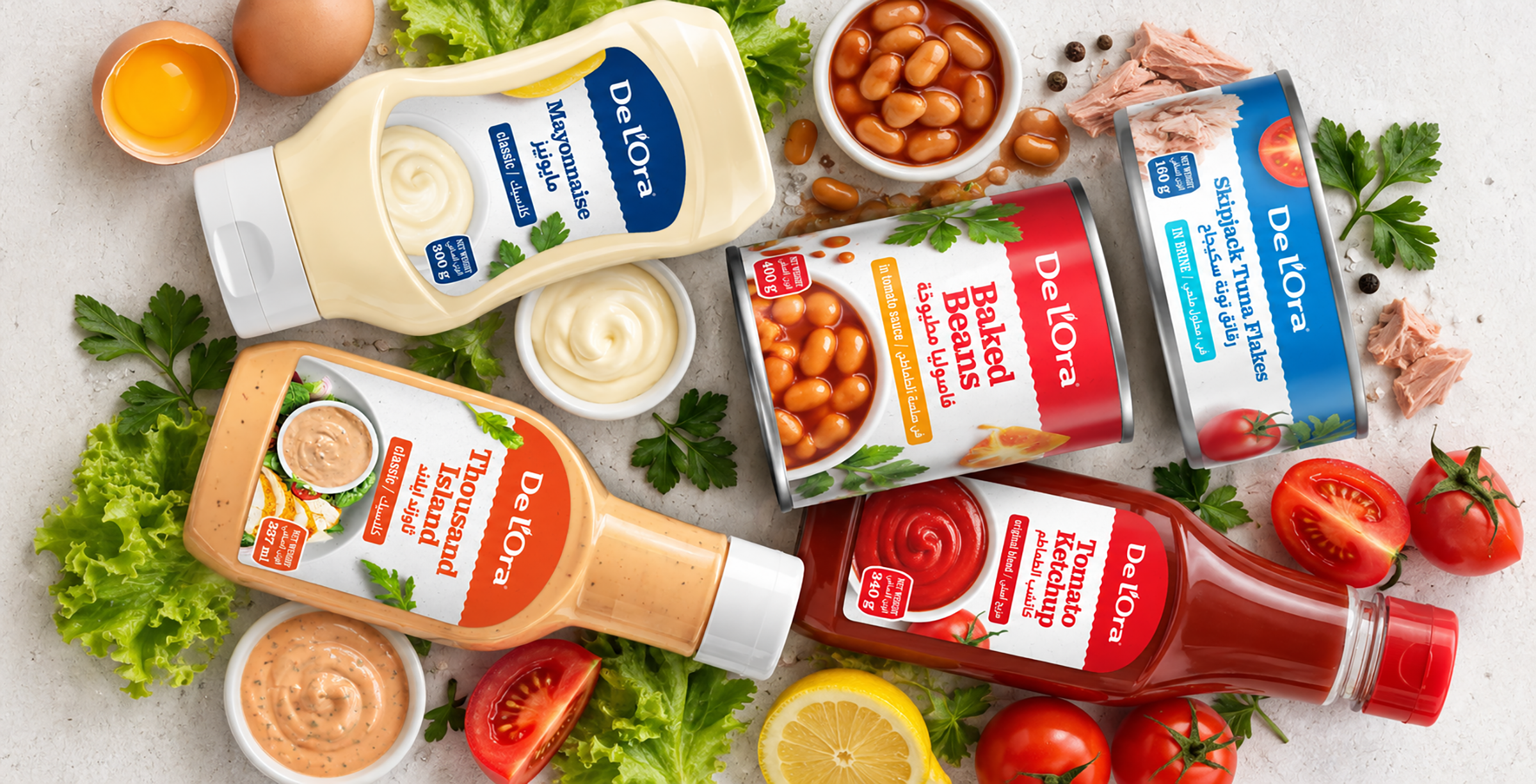
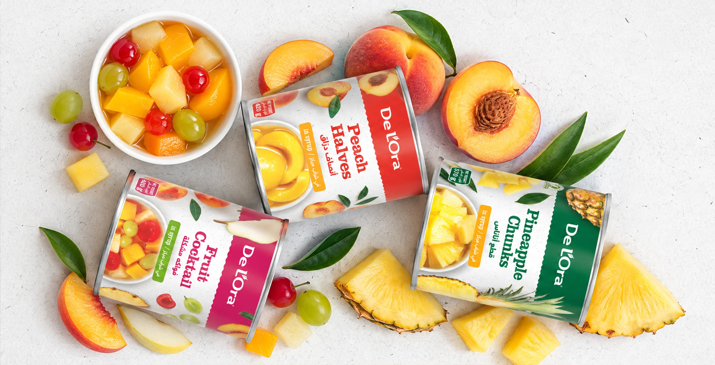
DESIGNED FOR A NEW SHELF. STILL DISTINCTLY DE L'ORA.